Case / 05
Navigation Beyond Hierarchy
Designing navigation for users who don't share the same mental model
Company
Skai (Formerly: Kenshoo)
Year
2021
Environment
Web SaaS
Type
Redesign
Role
Design Lead
Hands-on
No
Team
2 Designers · 1 PM · 1 Dev. Team
Context
Making a growing platform easier to navigate
As Skai expanded, new products, modules, and capabilities were continually added.
The navigation needed to help users:
- Reach familiar tools efficiently.
- Understand the platform's structure.
- Discover unfamiliar capabilities.
- Move quickly between daily workflows.
The existing navigation struggled to support both expert efficiency and feature discovery.
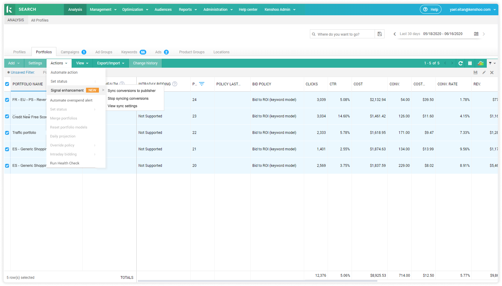
Challenge
No shared way to organize the platform
The existing navigation created two primary problems:
- A steep learning curve.
- Limited feature discoverability.
Users often struggled to find features unless they already knew where they were located.
To understand the problem, we conducted card-sorting sessions with clients, internal users, and training groups. We expected to identify a clearer grouping structure.
Instead, the research revealed a lack of consensus. Participants organized the same capabilities differently according to their roles, routines, and understanding of the platform.
The challenge was not simply finding better categories. It was designing navigation for users who did not share the same mental model.
No single hierarchy-Campaign managers organize the same platform around their own goals and tactics.
Insight
From one prescribed hierarchy to multiple paths
No single hierarchy could feel intuitive to every user.
The navigation needed to reduce its dependence on users correctly predicting where a feature belonged.
This led to three principles
- Visibility over prediction — expose options instead of making users guess.
- Recognition over recall — support scanning rather than memorizing paths.
- Multiple paths — combine shared navigation with personalized access.
Design Solution
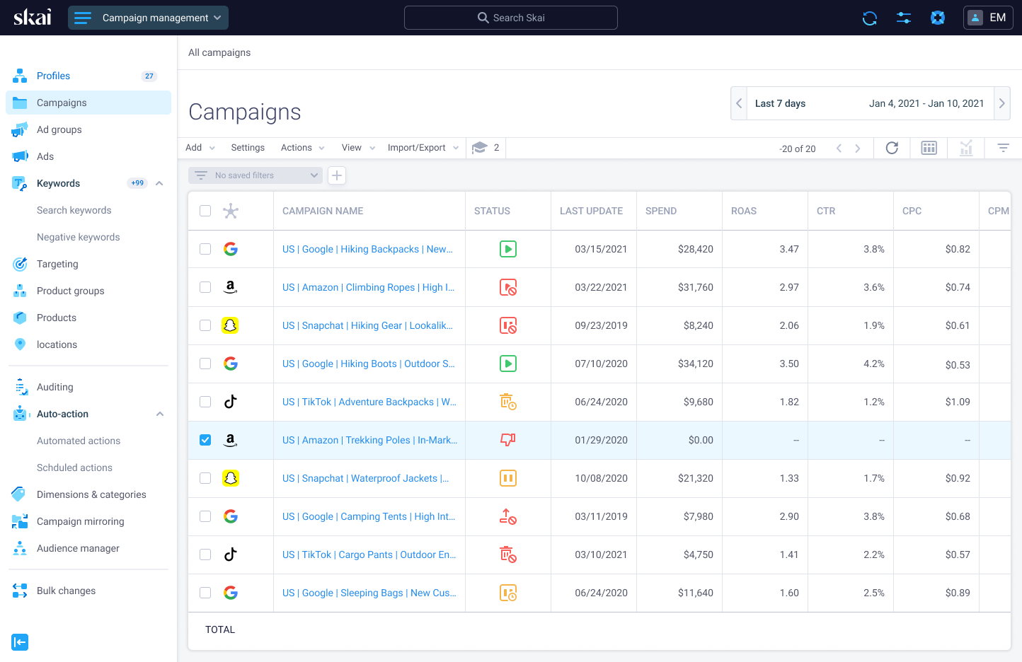
Navigation built around visibility and access
We combined three elements into one flexible navigation system:
- Mega menu — exposed the platform's capabilities in a single, scannable view.
- Customizable shortcuts — gave users direct access to frequently used features.
- Simplified Profile menu — moved secondary settings away from primary workflows.
Together, they supported two navigation modes:
- Explore and discover through the mega menu.
- Access and act quickly through personalized shortcuts.
This reduced the need to memorize paths while keeping a large platform easy to scan.
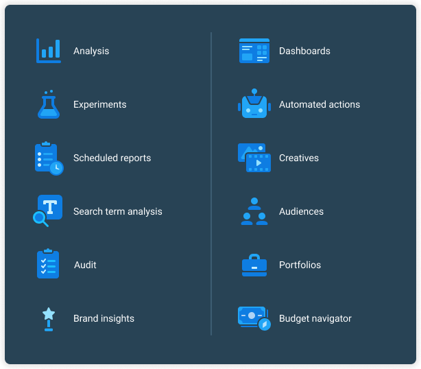
A scalable icon language
We created a unique duotone and three-tone icon system with two complementary styles:
- Interface icons — designed for compact use at 16 and 24 pixels, supporting navigation and common actions.
- Feature pictograms — designed for 24–48 pixels, giving products and capabilities a more distinctive visual identity.
- Color hierarchy — multiple tones added depth and recognition without introducing visual noise.
- Shared visual language — consistent geometry and styling connected both icon families across the platform.
The system helped users distinguish actions from features while making complex navigation faster to scan.
Impact
Navigation that increased feature usage
Our target was around 15% increase in feature usage.
Following the redesign
- Audit usage increased by 24%.
- Brand Insights usage increased by 31%.
- Experiments usage increased by 14%.
The redesign improved
- Feature discoverability.
- Navigation efficiency.
- Access to frequent workflows.
- Movement between related items.
The project demonstrated that navigation does more than organize a product. It directly influences whether users discover and adopt its capabilities.